Adding Texture to Complement Flat Surfaces
 09 November 2021

Adding Texture to Complement Flat Surfaces
Texture in interior design is more than how furnishings and surfaces feel. It is also about incorporating visual texture in the form of tactile objects such as fabrics, wood, metal, and stone. Mixing materials to complement surfaces while providing comfort and enhancing depth and dimension to a room takes the skill of an experienced interior designer.
We consulted with Rochelle Horn, CKBD, sales and design, Rosie Right | Design. Build. Remodel.
On Trend
One of the trends Horn is seeing a lot of is leathered or honed finished countertops. “They take the polish off, so it doesn’t reflect the light the same way and has a much different texture or feel to it. The downside of this finish is it can make the stone more vulnerable to staining.”

She notes that it is a very contemporary look. It may not appeal to people who prefer a traditional look.
She is also seeing a lot of large-format floor tile porcelain. They are big pieces, which means less grout, but high gloss. Tiles are 24 x 48 inches and larger. “These are more marbly-looking and almost have a glass finish, which in theory is lovely, but are they slippery when wet and how long will it shine?” Horn says. “It will be interesting to see how they wear over time.”
Large floor tiles can create a feature wall, which Horn likes.
While flat paint on walls is on-trend, Horn cautions that it doesn’t reflect any light and is difficult to clean and maintain.
Simple Incorporations
Throw pillows and blankets add a splash of color and texture. Mix and match them with table runners and slipcovers with woven fabrics that can be updated seasonally.
Carpets come in many styles, colors, and weaves. They provide warmth and have the added advantage of providing a non-slip surface. Consider the thickness, type of fiber, pattern, and style. For easy maintenance, use carpet in low-traffic areas.
The combination of glass and metal or glass and wood give the appearance of a larger space.
You don't have to go big to create texture. Add plants, books, and pottery in the kitchen or bathroom, where there are a lot of countertops and cabinetry. Consider reclaimed wood accents. It’s sustainable and the grainy texture brings a warm, organic touch to a room.
In the bathroom, add wood to the ceiling or as storage and mirror material. Metal elements can be paired with trinkets and smaller pieces, such as a wastebasket, towel rack, and toilet paper holder.
Mixing & Matching

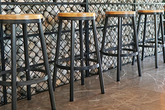
Create an industrial design with brick, wood, and metal. HomeZada offers these suggestions:
For example, beds with metal frames and wood panels, sofas in neutral tones with metal frames, wooden chairs, and tables with metal legs are a good place to start.
Stick to a sense of uniformity in the space. You might opt for a particular shade or pattern of wood, one type of metal you'll use everywhere, or some other unifying element in the room.
You don't have to stick to statement pieces to add wood and metal to your space. Combine them using coffee tables, side tables, mirrors, smaller desks, and other decorative items.
Balance cold metals with wood. Stick with shades and designs of wood that go well with the metal. Try not to go for too much contrast (i.e., modern-looking metal and antique wood or too much of a clashing color palette) and find a balance that works.
A Drywall Alternative
HomeZada suggests these materials in place of paint on drywall.

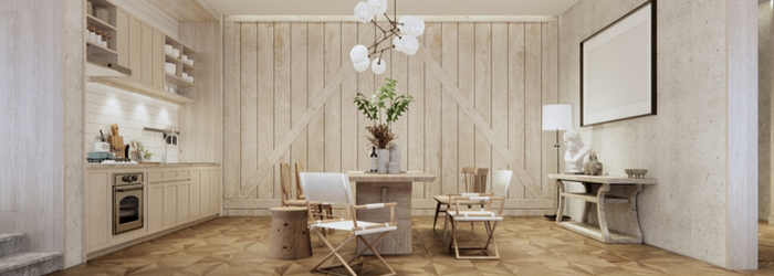
Wood planks are a good choice for a more rustic look. They’re easy to hang and offer plenty of wall space for you to hang wall décor. Available in many wood types, they can be painted or stained, depending on the look you want.
Note: Wood planks are susceptible to mold and require more maintenance than other types of wall finishes. Consider this when deciding on a finish.
Plywood used to be inexpensive and easy to install. Just like wood planks, plywood is susceptible to both mold and moisture, which can reduce its lifespan, so ventilation is key to preserving the life of this wall finish.
From industrial to cottage home designs, corrugated metal is used as a wall surface on the opposite side of a kitchen island or the ceiling.
Pegboards are useful in closets, home offices, pantries, garages, and storage rooms.
Considerations
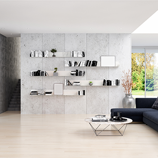
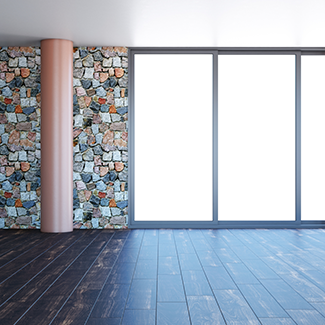
Open shelves and glass-front cabinets continue to be popular. Stacked stones are pieces of chipped granite stacked on top of each other and are often used as a backsplash or around fireplaces. But we live in the desert. Dust collects quickly – offering an unwanted texture. If you don’t like to dust and have a lot of pet hair floating around, these design options may not be a good idea.
“Pay attention to your environment and lifestyle, Horn cautions. “You may think you will behave differently in the new kitchen, but your habits are your habits. You likely won't act differently in your newly designed space.”
At some point, you need to draw a boundary when it comes to design. Too many statement pieces, features, colors, and textures can make a space uncomfortable. A professional designer will incorporate what you like, thus creating a space that is functional and enjoyable.
Extra Fun
While researching this blog, we came across this article from 1984 in the New York Times about the hot texture design trends.
###
Podcast
Rochelle Horn, CKBD Sales and Design Rosie Right Remodeling, has some great tips from the first contractor/design meeting to the finished product of your remodeling project. Working with a contractor you trust. Ironing out many questions like appliances to cabinets on what you hope to accomplish. Advantages of a masterplan for your project you don't have to complete all at once. Most important of all, bring a good dose of patience. It's a real virtue.
Photo Credit
- Shutterstock
Related Content
- Blog: Interior Trends For The 20's
- Blog: How Changes In Mirrors And Glass Can Update A Bathroom
- Blog: Kitchen Cabinets 101
- Blog: How To Get Interior Design On A Budget
- DIY FAQ: Interior Design Trend | Natural and Comfortable
- DIY FAQ: What Are The Latest Trends In Bathroom Accessories
- DIY FAQ: What Will An Interior Designer Help Me With?
- DIY FAQ: What's The Difference Between An Interior Designer and An Interior Decorator?
- Podcast: How Changes In Mirrors And Glass Can Update A Bathroom
Print this page
recent post
- Duck, Duck, Duct! How Often Should Ductwork Be Cleaned?
- Vinyl vs. Fiberglass Windows: Which Is The Better Choice Of Replacement Window?
- We May Be The Grand Canyon State, But The Rocky Mountains Are Important For Arizona
- Welcome to Arizona! Things A Newbie to Arizona Should Know
- The Pros & Cons of Buying A Flipped House
- Getting In On The Ground Floor
- Why It’s More Critical Than Ever To Get Your AC Serviced Before Summer
- The Reality of Remodeling
- What To Look For When Comparing Your Roofing Quotes
- What To Expect When Buying New Windows & Doors
